
Like most other spheres of life, the covid19 pandemic has also influenced the world of medical literature. There are more open access resources than ever before. In any case, there has been an information overload in the digital era. With more and more information available, the attention span has reduced considerably. We have always known that an abstract accompanying any medical publication is expected to be ‘stand-alone,’ and self-explanatory so that the reader gets an overview of the study and its findings and can decide whether he/she wants to read the full text. With more information and a reduced attention span, the reader would probably like to save even the time it takes to read an abstract. Moreover, visuals are easier to comprehend and remember. A graphical abstract is expected to do just that. This is not to say that graphical abstracts did not exist before the pandemic or that they will replace text abstracts. The text abstracts will stay because graphical abstracts do not show up in the results when you are searching for a topic on a search engine like google. They are published in the journals’ ‘table of contents’ of an issue and provide readers with a quick overview of the study. Many major publications now ask for a graphical abstract. However, most medical writers and researchers are uncomfortable with creating it themselves and perhaps think they need to seek a skilled graphic designer. In reality, creating a graphical abstract is very simple, and there are free resources that are easy for anyone to use.
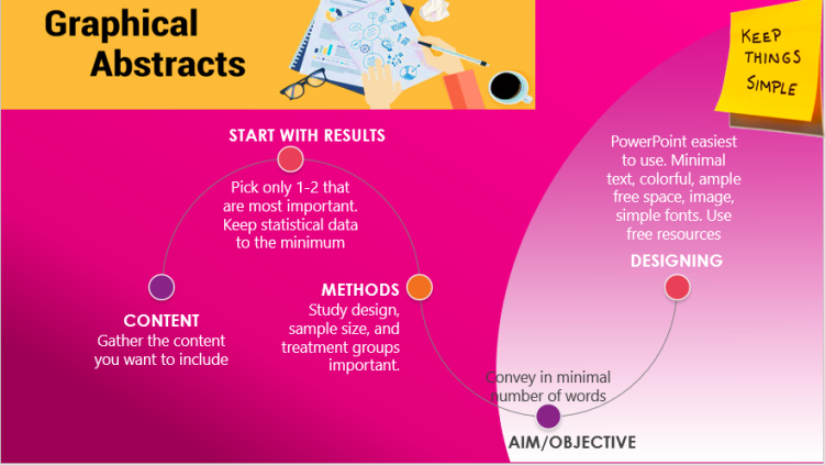
Before we get to designing, we need to decide on the content that will go in. First, gather the main points you would like to highlight in the graphical abstract. Just like the text abstract, the main points are the Aim/objective, methodology, and results. So the text abstract itself is a good starting point to create the graphical abstract. The difference is that in a text abstract you can write these in detail while here you want to create an infographic. How do you fit so much information in a single image? Begin with the results. Look at the text abstract and pick up only 1 or 2 most important outcomes. Leave out a lot of statistical details if you think that space is indeed a constraint. Next, look at the Methods. Here, the most important parameters are sample size, study design, and treatment groups. Lastly, the objective. See how can convey it in the bare minimum number of words.
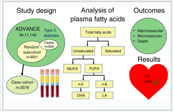
Now you have the content and need to assemble it all. Remember, you are trying to create a visual impact. So the text should be minimal, the infographic should be colourful yet professional, and there should be ample free space, so it does not appear cluttered. If possible, try to fit in an image or two to create an impact. Avoid fancy fonts and stick to routine ones like Times New Roman/Arial/Helvetica/Calibri. What tools can you use? Don’t underestimate the good old power point. It has various tools like Smart Art, shapes, icons and images. Here is one example I found from the Diabetologia journal, which looks like it has been created using PowerPoint.
Look at a couple more in the same issue of the journal here: https://diabetologia-journal.org/graphical-abstracts/
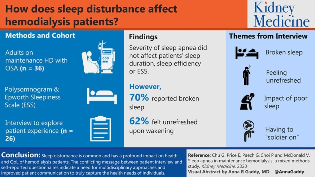
Here is one more from elsevier which seems to be a PowerPoint creation as well. The images here can be found as ‘Icons’ in PowerPoint.
If you want more professional and free resources, check out adobe here: https://express.adobe.com/sp/search?homeBackType=home&collectionSpec=%7B%22path%22%3A%22Poster%22%2C%22topics%22%3A%5B%22poster%22%5D%7D These are ready templates that can be customized as you want them. They also provide you with options to choose different images for a given template, change the shape, colour etc.
Try resources like these, and you will want to create all your graphics yourself henceforth. Embrace art, and you will enjoy it…..it is also a huge stress buster. All the best to you!!
